Brand Psychology · Social Media Strategy · May 2026 · 7 min read
Before a single word is read, your audience has already formed an opinion. Here’s how the invisible science of color and typography is either building your brand or quietly killing it.
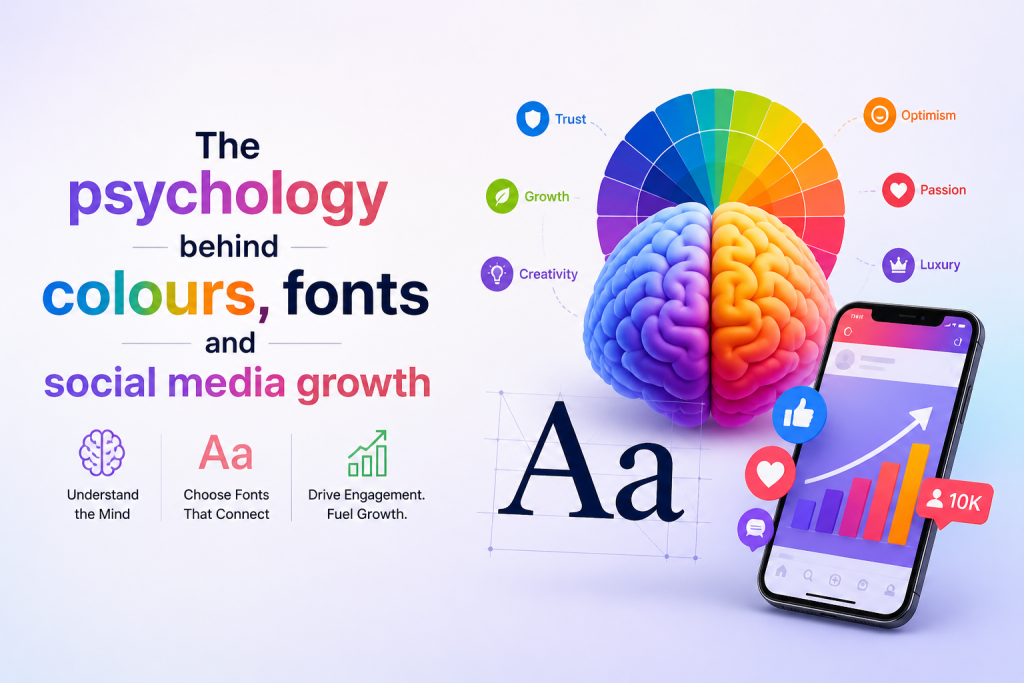
You have 50 milliseconds. That’s the time it takes a person scrolling through their feed to form a first impression of your content. Not 50 seconds. Not 5. Fifty milliseconds less than a blink. In that fraction of a moment, no one is reading your caption or watching your video. They’re reacting to something far more primal: color, shape, and the feel of your typography.
Understanding the psychology behind these elements isn’t a design luxury. It’s a growth strategy. And for brands serious about social media, it may be the single most underleveraged tool available.
| 90%of snap judgments about products are based on color alone | 80%increase in brand recognition from consistent color use | 95%of top brands use only one or two colors in their identity |
Color is not decoration , it’s communication
Every color carries a psychological payload. It arrives before language, bypasses rational thought, and lands directly in the emotional brain. This is why color choices in branding aren’t aesthetic preferences
they’re strategic decisions that shape how your audience feels about you before they even know why.
| Blue Trust, authority, calm. Dominant in finance, tech & healthcare brands. | Coral / Red Urgency, passion, appetite. Drives clicks and impulse action. | Green Growth, wellness, sustainability. Signals balance and reliability. | Purple Creativity, luxury, wisdom. Favoured by premium and lifestyle brands. |
On social media, this plays out in every frame. A feed dominated by warm coral drives urgency and stops thumbs. A cool blue palette signals trustworthiness, making it ideal for thought leadership content. A soft sage green communicates wellness without trying too hard. The brands that grow the fastest aren’t just making pretty content they’re making strategically colored content that triggers the right emotional response at the right time.
Consistency amplifies the effect. When a brand commits to a signature color palette and holds it across every post, story, and reel, that palette becomes a signal. Before the audience reads a word, they already know who they’re hearing from and they’ve already started to feel something.
Typography: the voice your visuals speak in
If color is emotion, typography is personality. The fonts you choose don’t just display words they convey tone, credibility, and character. A serif font whispers heritage and authority. A rounded sans-serif says friendly and modern. A high-contrast display type communicates confidence and edge.
| SERIF Heritage,Trust, editorial authority, luxury. Best for premium brands & long-form thought leadership. | SANS-SERIF Modern,Clean, accessible, forward-thinking. Works across every format and screen size. | DISPLAY /SCRIPT SignatureDistinctive, expressive, memorable. Ideal for lifestyle, creative & personal brands. |
The mistake most brands make isn’t choosing the wrong font. It’s choosing too many. When three or four different typefaces appear across a brand’s content, the psychological effect is noise the brain reads inconsistency as unreliability. A single primary font, used with intention and hierarchy, creates a visual signature as recognisable as a logo.
“Typography is the silent salesperson of your brand. It’s there on every post, setting expectations before a single word lands. The question isn’t what you say it’s whether your fonts say it credibly.”
Font weight and sizing carry psychological weight too. Large, bold type in a feed communicates confidence and clarity it assumes its place deserves to be noticed. Smaller, lighter type signals refinement and subtlety. Neither is superior; both are choices. What matters is that the choice is intentional, consistent, and aligned with how you want your audience to feel.
Where color, type & growth converge
The compounding effect of consistent color and typography on social media growth is measurable, not theoretical. Brands with a coherent visual identity generate higher save rates, stronger brand recall, and significantly better follower retention than those without one. This isn’t because aesthetics make content better, it’s because the brain rewards pattern recognition with trust.
Every time a user sees your signature colors, their brain makes a micro-prediction: “I know this brand. I’ve seen them before. I’ve felt something with them before.” That prediction reduces friction. It makes pausing on your content, engaging with your caption, or clicking your link feel like a natural next step rather than a risk.
This is why the brands winning on social media in 2026 aren’t just producing great content they’re building a visual language that makes every piece of content feel like part of something larger. They’ve stopped asking “does this look good?” and started asking “does this feel like us?”
At Social Nest Pro, we help brands build that visual language from the ground up designing content systems where color and typography do the psychological heavy lifting, so that every post builds equity, not just impressions.
| Build a brand your audience remembersLet Social Nest Pro design a visual identity that works as hard as your content does.→ Start with Social Nest Pro at socialnestpro.com |
Social Nest Pro Team
Brand psychology, content strategy, and social media growth built for brands that want to be remembered.